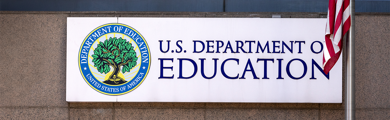
As concerns continue to grow around the federal government’s decision to dismantle the Department of Education, many editors and reporters who focus on education have been worried about access to data on public schools and the districts they operate in.
Rachel Rush-Marlowe, the founder and executive director of the education policy think tank ResearchEd and a former Education Department employee, spoke with NPF’s Widening the Pipeline fellows about how to access education data and accurately represent what the statistics communicate in their stories.
“I think at a time when education data is really at risk, it’s important that journalists are empowered to know how to use it, where to get it, and what we can do with it,” Rush-Marlowe said.
3 Key Takeaways:
1. The narrative you tell and the context it amplifies should go hand in hand
A great place to start with writing stories that include data is by figuring out what your goal is, according to Rush-Marlowe.
“None of [the data] matters if you don’t have something else to say to go with it,” she said.
“What kind of storytelling are you trying to do? Do you want to convey a single data point or are you trying to show comparisons, distributions, trends?” she said.
After this, determine what kind of data you’re using. For example, is it continuous data is organized numerically, whereas categorical data is organized by categories, Rush-Marlowe explained.
Understanding how to contextualize data is crucial to determining your use of it in a story.
“Bad visuals get used wisely. People don’t understand and how to fact check them,” she said.
After this, pick a chart type.
Rush-Marlowe suggests using Canva, Tableau, High Charts, Flourish, Raw Graphs and Excel for making charts.
2. Vanishing numbers may be a story in itself
“This disappearing data is going to be really detrimental to our communities and to our understanding of even how detrimental it is, because we can’t collect information on how poorly people are being served or how well people are being served,” she said.
In order to still keep track of certain data, there are still websites journalists can use.
Wayback Machine, Zelma.ai, PNPI Data Explorer and Data Rescue Project are all resources that Rush-Marlowe recommends.
It’s also important to still ‘data clean’ and make sure there are no typos or inconsistencies.
3. Be aware of “cherry-picking data”
“We have to be really careful of cherry picking data and thinking about our own biases and how our biases can impact the stories that we tell and what we see in the data,” she said.
It can be easy to only look for data that supports a story idea, so it’s important to remain objective.
“In order to be effective creators of our own compelling stories and data visualizations, we have to be critical consumers of others. And we have to be critical about our own biases,” Rush-Marlowe said.
Access the full transcript here.
This fellowship is funded by the Evelyn Y. Davis Foundation. NPF is solely responsible for the content.